
Using Python libraries for Data Manipulation and Visualization
Here's a brief explanation of each line:
-
import matplotlib.pyplot as plt: This line imports thepyplotmodule from thematplotliblibrary and renames it asplt.matplotlibis a plotting library, andpyplotis its easy-to-use module which provides a MATLAB-like interface. -
import pandas as pd: This line imports thepandaslibrary and renames it aspd.pandasis a software library for data manipulation and analysis. It provides data structures and functions needed to manipulate structured data. -
data = pd.read_csv('case_time_series.csv'): This line reads a CSV file named 'case_time_series.csv' into a DataFramedata. -
Y = data.iloc[61:, 1].values: This line selects all rows from index 61 onwards and the second column from the DataFramedataand assigns it toY. -
R = data.iloc[61:, 3].values: This line selects all rows from index 61 onwards and the fourth column from the DataFramedataand assigns it toR. -
D = data.iloc[61:, 5].values: This line selects all rows from index 61 onwards and the sixth column from the DataFramedataand assigns it toD. -
X = data.iloc[61:, 0]: This line selects all rows from index 61 onwards and the first column from the DataFramedataand assigns it toX. -
plt.figure(figsize=(25, 8)): This line creates a new figure with a specific size. -
ax = plt.axes(): This line creates an Axes instance, which is the region of the image with the data space. -
ax.grid(linewidth=0.4, color='#8f8f8f'): This line adds a grid to the plot with a specific line width and color. -
ax.set_facecolor("black"): This line sets the face color of the Axes instance to black. -
ax.set_xlabel('\nDate', size=25, color='#4bb4f2'): This line sets the label for the x-axis, its font size, and its color. -
ax.set_ylabel('Number of Confirmed Cases\n', size=25, color='#4bb4f2'): This line sets the label for the y-axis, its font size, and its color. -
plt.xticks(rotation='vertical', size='20', color='white'): This line sets the properties of the x-axis tick labels. The labels are rotated vertically, their font size is set to 20, and their color is set to white. -
plt.yticks(size=20, color='white'): This line sets the properties of the y-axis tick labels. Their font size is set to 20 and their color is set to white. -
plt.tick_params(size=20, color='white'): This line sets the properties of the tick parameters. Their size is set to 20 and their color is set to white. -
for i, j in zip(X, Y):: This line starts a loop that goes through each pair of values inXandY. -
ax.annotate(str(j), xy=(i, j+100), color='white', size='13'): Inside the loop, this line adds an annotation for each point in the plot. The annotation is placed slightly above the point. -
ax.annotate('Second Lockdown 15th April', xy=(15.2, 860), xytext=(19.9, 500): This line adds an annotation 'Second Lockdown 15th April' at the point (15.2, 860) and the text is positioned at (19.9, 500). The code is incomplete and should end with a closing parenthesis.
import matplotlib.pyplot as plt
import numpy as np
import pandas as pd

data = pd.read_csv('case_time_series.csv')

Y = data.iloc[61:, 1].values
R = data.iloc[61:, 3].values
D = data.iloc[61:, 5].values
X = data.iloc[61:, 0]

plt.figure(figsize=(25, 8))

ax = plt.axes()
ax.grid(linewidth=0.4, color='#8f8f8f')

ax.set_facecolor("black")
ax.set_xlabel('\nDate', size=25, color='#4bb4f2')
ax.set_ylabel('Number of Confirmed Cases\n',
              size=25, color='#4bb4f2')

plt.xticks(rotation='vertical', size='20', color='white')
plt.yticks(size=20, color='white')
plt.tick_params(size=20, color='white')

for i, j in zip(X, Y):
    ax.annotate(str(j), xy=(i, j+100), color='white', size='13')

ax.annotate('Second Lockdown 15th April',
            xy=(15.2, 860),
            xytext=(19.9, 500),
            color='white',
            size='25',
            arrowprops=dict(color='white',
                            linewidth=0.025))

plt.title("COVID-19 IN : Daily Confirmed\n",
          size=25, color='#28a9ff')

ax.plot(X, Y,
        color='#1F77B4',
        marker='o',
        linewidth=4,
        markersize=15,
        markeredgecolor='#035E9B')

ax.tick_params(axis='y', colors='#1F77B4')

plt.xticks(X, rotation='vertical', size='20', color='#1F77B4')
Output:

Creating a pie chart of different activities using matplotlib
Here's a brief explanation of each line:
-
import matplotlib.pyplot as plt: This line imports thepyplotmodule from thematplotliblibrary and renames it asplt. This module provides a MATLAB-like interface for making plots and charts. -
slices = [62, 142, 195]: This line creates a list namedslicesthat contains the sizes of portions of the pie chart. -
activities = ['Travel', 'Place Visit', 'Others']: This line creates a list namedactivitiesthat contains the labels for the portions of the pie chart. -
cols = ['#4C8BE2', '#00e061', '#fe073a']: This line creates a list namedcolsthat contains the colors for the portions of the pie chart. -
exp = [0.2, 0.02, 0.02]: This line creates a list namedexpthat contains the "explode" values for the portions of the pie chart. These values determine how far each portion is offset from the center of the pie. -
plt.pie(slices, labels=activities,...): This line creates a pie chart with the specified sizes, labels, colors, explode values, and other properties. -
textprops=dict(size=25, color='black'): This line sets the text properties for the labels of the pie chart. -
radius=3: This line sets the radius of the pie chart. -
colors=cols: This line sets the colors of the portions of the pie chart. -
autopct='%2.2f%%': This line sets the format of the percentage labels inside the pie chart. -
explode=exp: This line sets the explode values of the portions of the pie chart. -
shadow=True: This line adds a shadow to the pie chart. -
startangle=90: This line sets the start angle of the pie chart. -
labeldistance=1.2: This line sets the radial distance of the labels from the center of the pie chart. -
plt.title('Transmission\n\n\n\n', color='#4fb4f2', size=40): This line sets the title of the pie chart, its color, and its size. The\n\n\n\ncreates new lines to add space between the title and the pie chart.
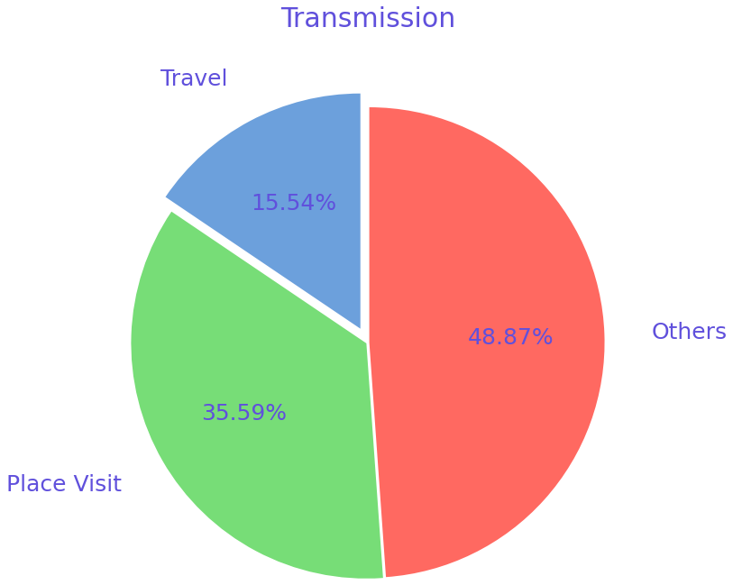
import matplotlib.pyplot as plt

slices = [62, 142, 195]
activities = ['Travel', 'Place Visit', 'Others']

cols = ['#6CA0DC', '#77DD77', '#FF6961']
exp = [0.2, 0.02, 0.02]

plt.pie(slices, labels=activities,
        textprops=dict(size=25, color='#6050DC'),
        radius=2,
        colors=cols,
        autopct='%2.2f%%',
        explode=exp,
        shadow=False,
        startangle=90,
        labeldistance=1.2)

plt.title('Transmission\n\n\n\n', color='#6050DC', size=30)
Output of this code:
COVID-19 Case Breakdown by District in Maharashtra
Here's a brief explanation of each line:
-
plt.xticks(rotation='vertical', size='20', color='#A367B1'): This line sets the properties of the x-axis tick labels. The labels are rotated vertically, their font size is set to 20, and their color is set to#A367B1. -
plt.yticks(size='20', color='#A367B1'): This line sets the properties of the y-axis tick labels. Their font size is set to 20 and their color is set to#A367B1. -
ax.set_xlabel('\nDistrict', size=25, color='#A367B1'): This line sets the label for the x-axis, its font size, and its color. -
ax.set_ylabel('No. of cases\n', size=25, color='#A367B1'): This line sets the label for the y-axis, its font size, and its color. -
plt.tick_params(size=20, color='#A367B1'): This line sets the properties of the tick parameters. Their size is set to 20 and their color is set to#A367B1. -
ax.set_title('Maharashtra District wise breakdown\n', size=50, color='#A367B1'): This line sets the title of the plot, its font size, and its color. -
plt.bar(x, co, label='Confirmed', color='#5D3587'): This line creates a bar plot for the confirmed cases. The color of the bars is set to#5D3587. -
plt.bar(x, re, label='Recovered', color='#A367B1'): This line creates a bar plot for the recovered cases. The color of the bars is set to#A367B1. -
plt.bar(x, de, label='Deceased', color='#FFD1E3'): This line creates a bar plot for the deceased cases. The color of the bars is set to#FFD1E3. -
for i, j in zip(x, co):: This line starts a loop that goes through each pair of values inxandco. -
ax.annotate(str(int(j)), xy=(i, j+3), color='#A367B1', size='15'): Inside the loop, this line adds an annotation for each bar in the plot. The annotation is placed slightly above the top of the bar. -
plt.legend(['Confirmed', 'Recovered', 'Deceased'], fontsize=20): This line creates a legend for the plot. The font size of the legend is set to 20.
import matplotlib.pyplot as plt
import pandas as pd

data = pd.read_csv('district.csv')
data.head()

re = data.iloc[:30, 5].values
de = data.iloc[:30, 4].values
co = data.iloc[:30, 3].values
x = list(data.iloc[:30, 0])#392467

plt.figure(figsize=(25, 10))
ax = plt.axes()

ax.set_facecolor('#392467') #bg color
ax.grid(linewidth=0.4, color='#A367B1')

plt.xticks(rotation='vertical',
           size='20',
           color='#A367B1')

plt.yticks(size='20', color='#A367B1')

ax.set_xlabel('\nDistrict', size=25,
              color='#A367B1')
ax.set_ylabel('No. of cases\n', size=25,
              color='#A367B1')

plt.tick_params(size=20, color='#A367B1')

ax.set_title('Maharashtra District wise breakdown\n',
             size=50, color='#A367B1')

plt.bar(x, co, label='Confirmed', color='#5D3587')  # confirmed color
plt.bar(x, re, label='Recovered', color='#A367B1')  # recovered color
plt.bar(x, de, label='Deceased', color='#FFD1E3')  # deceased color

for i, j in zip(x, co):
    ax.annotate(str(int(j)),
                xy=(i, j+3),
                color='#A367B1',  # changed color to #6050DC
                size='15')

plt.legend(['Confirmed', 'Recovered', 'Deceased'],
           fontsize=20)
Output:
